
PARCC is finished in my district! It couldn’t have gone better. My Central PARCC team did a great job running the tests, the teachers were amazing, and the kids were fantastic. It was a total team effort and a smooth event from start to finish.

Now, to me, the fun starts. If you’re an avid reader of my site, you know I have a small obsession with data. So, after the first part of PARCC (PBA for those in the know), we made sure we surveyed all of our kids. It was important to me and my district to survey our kids because 1) we worried that the PARCC-peeps may not share their end of the year survey data with districts and 2) we wanted to make the best decisions we could for our kids as soon as possible.
The spreadsheet of responses for our Post-PARCC survey is 20 columns wide and 600 rows deep. Sheets like this use to scare me. Now, I love them. Why? Pivot Tables!
A Pivot Table is a data summarization tool found in most commercial spreadsheets (Google Sheets, Excel, etc.). I love Pivot Tables because it allows me to drill down into data and find meaningful takeaways to share with my school and community. With this PARCC data, I’m looking for takeaways that can improve the PARCC experience and instruction for my district.
Here’s an example of how I used Pivot Tables recently that will highlight their power:
One of our survey questions asked kids if they preferred to take the PARCC online or on paper. Here’s a pie chart of their responses:

Without using a Pivot Table, I’d have to take this information for what it is, but what if I wanted to break this data down even further, say by grade, to see if I can glean anything that might make kids more comfortable with online testing. With Pivot Tables this is a breeze! Here’s how I setup a Pivot Table for a deep dive into this pie chart.

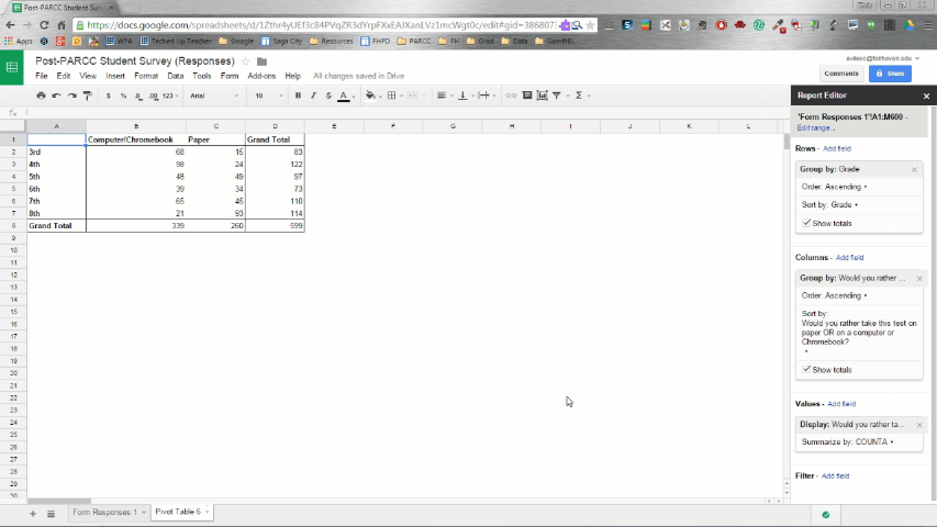
First, Data -> Pivot Table. Then I set the row’s value to Grade and the Column’s value to the question I wanted to dive into. Next, I filled the Pivot Table with the answers to the question I wanted to dissect, and finally set it to summarize the values by COUNTA which is how you turn written feedback into numerical data.
Now, my Pivot Table looks like this:

3rd and 4th graders favored online testing. 5th, 6th, and 7th graders were split. 8th graders preferred paper-based testing by a wide margin.
Now, conjecture! I wondered if 3rd and 4th graders preferred online testing because, for lack of a better way to say it, they don’t know any better. In New Jersey, until this year, they’ve been testing everyone on paper starting in 3rd grade. This is the first year that everyone has taken an online standardized test. Most people don’t like change, so maybe it wasn’t the online nature of the test 5th-8th graders didn’t like, but the fact that they weren’t use to it. I mean, 8th graders, who were the least into online testing, were the most use to paper testing. 3rd and 4th graders who preferred online testing have had the least experience with paper-based standardized testing.
I won’t be able to test this familiarity hypothesis until/unless PARCC releases the end of the year data, then I can look at change over time in test preference.
But as they often do, this hypothesis led to another. I started to wonder if student preference for paper testing had anything to do with a lack of device use. I mean, I would think that a student who was unfamiliar with how to use a device in an academic setting would prefer paper-based testing.
Luckily, with the help of a Pivot Table, I can dive even deeper into this question. Check it out:
By adding the question and data, “How often do you use a computer or Chromebook in school” to the row section of my Pivot Table, I can make a Pivot Table that not only breaks students down by grade and shows me if they prefer online testing over paper, but also juxtaposes that with how often they self-reported using devices in school.
Here’s what the Pivot Table looks like now:

Looking at the original Pivot Table of 5th, 6th, and 7th graders ambivalence toward online testing, and knowing that my students in those grades share Chromebooks, my original recommendation to my district probably would have been to get them more Chromebooks. Thanks to the Pivot Table, I can see that would have been a bad call. The new Pivot Table clearly shows my district does a fantastic job getting devices into the hands of our students. I may still recommend getting more devices for other reasons, but device use and preference for online testing don’t seem to be correlated.
That may not sound sexy, since I didn’t figure out why our middle grades weren’t thrilled with online testing, but not knowing the cause of something is just as important as knowing the cause. Instead of making the wrong recommendation, I can continue to explore the reason, if any, our middle grades were neutral toward online testing with the hopes of making the experience better for them.
This is just one recent way I’ve used Pivot Tables, but I encourage everyone to constantly survey students. Before I left the classroom, I surveyed my students every two weeks on a variety of things. I then used Pivot Tables to dive deep into their responses to refine my teaching practices. Now, out of the classroom, I’m using them to help my leadership team make the best decisions we can for our staff and students.
I’m an English teacher, so if I can do it, anyone can do it. Give Pivot Tables a try, they’re amazing.
Until Next Time,
GLHF
cross-posted at Teched Up Teacher
Chris Aviles presents on education topics including gamification, technology integration, BYOD, blended learning, and the flipped classroom. Read more at Teched Up Teacher.


