#GAFE Perceptions Report: Part 2 - Comparing Surveys & Data

This post is part 2 in my series #GAFE Impact Report, sharing data and analysis about student and teacher perceptions of the impact of Google Apps for Education. The results come from a 2014 survey I designed, implemented, and analyzed in my school. Be sure to check out Part 1: Overview & Infographic. Though limited to my school, I believe these results to be informative and representative of many schools in the early stages of GAFE integration. Please share your thoughts and feedback on these posts, the survey, or the findings in the comments or on Twitter.
Once the inspiration for this study hit, I knew what I needed to do. Ideas, questions, and complications circled through my mind for a few days. I listed my ideas, tried to put them in order, and to figure out what I was really looking for. Who did I want to survey? How? Where? Why? What was I going to do with the data? I had some answers to these questions and more ideas than I knew what to do with. Little did I know it at the time, but a lot of this process was what led me to my current doctoral studies. With the #GAFE Impact Report, I learned a lot of survey design, methodology, and data analysis, which helped focus my interests back towards further studies.
Luckily, I had some friends at work to bounce ideas off of and quickly made some decisions. I would create Google forms for all teachers and students. Students were easy; I could ask my English teacher colleagues to assign the survey, either in class or for homework. I decided to collect usernames in my domain so I could ensure unique responses from each students and let teachers know when their students had all completed it--although their responses remained private. For the teachers, I e-mailed a different Google form with a plea for their help. I explained my goals and purpose and asked that they complete the form over a two-week window. I then followed up in person with some departments, and after a lot of leg work had overall success. Although my administration okayed my work, it was important that I ask for honest feedback and data as a colleague and not as a forced or mandated survey from a supervisor.
The surveys took a while to design and finalize, and I’m pretty happy with the questions I asked, even now. By Thanksgiving or so, I was ready to roll out my baby.
Survey Design
Thankfully, my friend and mentor Tina has her PhD. She had the knowledge, experience, and insight into survey design, methodology, and motivating busy teachers to respond, which I sorely lacked. I didn’t need a doctoral-level project here, but I wanted to make sure that my study was fair, purposeful, and meaningful. She helped me decide on a mixed-methods approach, including both quantitative and quantitative questions.
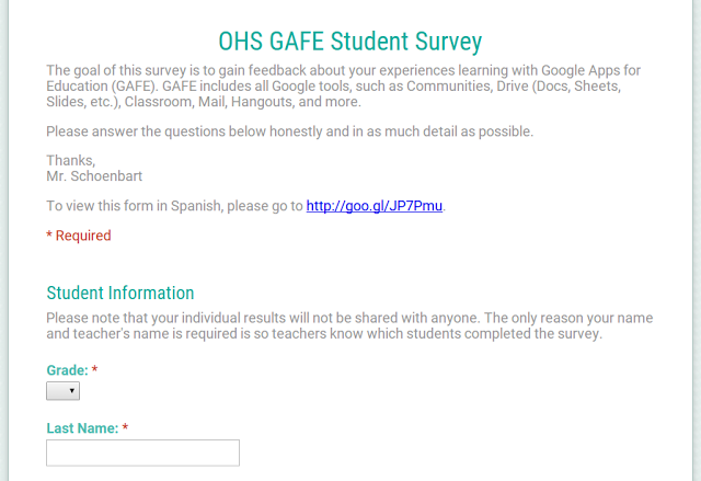
The quantitative questions provided the hard data and were required. The qualitative ones asked for supporting responses, and some were optional. I wanted to make the survey easy for responders, with the hopes that this would give me more in depth responses. And it mostly worked. There were some topics, like the value of electronic feedback, that were important to me, but ultimately proved to be too much. I wanted to survey to be clear and focused, so I tried to connect everything back to the impact of Google Apps on Teaching and Learning.
Students
Teachers
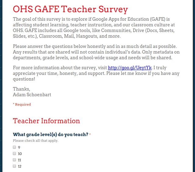
As of this posting, the surveys are public but when they were administered they were closed to my domain and collected usernames. The required questions for students were the same. For the teacher survey, all demographic or grid-based questions were required. For this public view, the only required question is at the end of the first page because its answer determines which page is next on the survey.
Tools and ideas to transform education. Sign up below.
Comparing Data: The Beginning
Within a few weeks, and after some gentle reminders, I had survey data from 630 students (47%) and 43 teachers (43%), enough to provide a statistical representation of my school’s population.
I also had another tool: two similar studies from presentations a few months earlier. In April 2014, I surveyed my students for a presentation at LHRIC’s Tech Expo, and then in October for NY #Gafesummit. Only 230 students were surveyed in each of these studies, but the trends and data are interested and informative. With this combined data, I could compare statistics, trends, and growth from the 8-month period, which show that almost all of the statistics about GAFE’s positive impact grow.
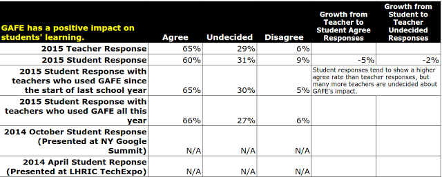
Next time, we’ll take a look at that data and it’s evolution in more detail. You can find the Comparative Data Sheet online to get a head start.
As always, please leave your comments below or reach out on Twitter. I would love to hear what you think about this study or your own ideas about GAFE’s impact.
cross posted at www.aschoenbart.com
Adam Schoenbart is a high school English teacher, Google Education Trainer, and EdD candidate in Educational Leadership. He teaches grades 10-12 in a 1:1 Chromebook classroom at Ossining High School in Westchester County, NY and received the 2014 LHRIC Teacher Pioneer Award for innovative uses of technology that change teaching and learning. Read more at The SchoenBlog and connect on Twitter @MrSchoenbart.
