Holy Sheets! Minds-on Interactive Spreadsheet Adventures
Free interactive STEM spreadsheets can get your students started in both simple and complex computations.

Tools and ideas to transform education. Sign up below.
You are now subscribed
Your newsletter sign-up was successful
The golden rule in Google Sheets: To get an interactive version that you can edit, go to the File menu and select "Make a copy." This saves the file in your Drive account.
Are you ready to see the power of spreadsheets for mathematical, statistical, and scientific thinking? Let’s follow the path of using data to derive a mathematical model and then, using the model, to build an interactive simulation. A survey of 330 teachers found the No. 1 data analysis tool was – wait for it – Google Sheets! MS Excel was third.
Spreadsheets are the low-end of the computational food chain and can get your students started in relatively simple computations that can get really jacked-up if you want.
Google Sheets offers the big advantage of being free and allows for online collaborative efforts in the classroom and out-of-class projects.
Article continues belowData - Large and Small
Collect your own (first-hand, you are performing the measurements)
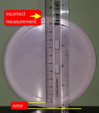
Collecting experimental data allows the introduction of simple measurement error analysis using centimeter rulers such as Investigating the Height of a Stack of Cookies (good first modeling activity with a “just-add-data” Excelet link). A good source of small real-world data sets (second-hand) is the Quantitative Environmental Learning Project (QELP) website. You can download data as an Excel file that can easily be converted to a GSheets file with no problem.

Exploring Error in Measurements
There are two major groups of errors, random and systematic (adds bias), and both can be built into spreadsheet simulations such as “just-add-data” spreadsheets.
Tools and ideas to transform education. Sign up below.
So, how do you integrate error into a spreadsheet? Let’s examine an important measurement device, the ruler, using the Rulers and Measurement Error Excelet to explore the types of errors in a variety of ways.
Big data sets with scatter
Many scientific groups make data available for downloading, and some even make it easy. The file format, .csv (comma separated values as a text file), can be read by Sheets and Excel. Data on web pages that are column-separated can be saved as text files and read by spreadsheets. If you are going to have students download data, check it out first to see the results! It can be messy.
Sea Level Change (and other global problems) is a large collection of GSheets spreadsheets in which data from NASA, NOAA, and other sites have been downloaded and are ready for plotting (see the guides below). A large number of possible questions and tasks are included to aid instructors to modify to suit their classrooms. Dealing with big data with scatter is an important task that students need to get involved in handling it!
How to get started from scratch
Dealing with Data in Excel 2013/2016 - detailed handout for Excel (more about building later)
Dealing with Scientific Data in Google Sheets - Video instructions with an accompanying GSheets spreadsheets for hands-on practice
Mathematical Models and a Multivariable Approach
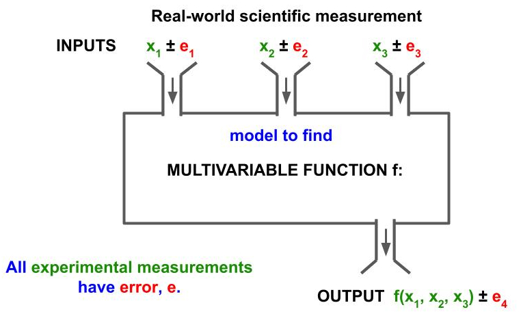
Deriving a mathematical model from data has become commonplace in math classes from middle school through college. These models, and so many science experiments, tend to be bivariate; however, in the real-world, things are multivariate plus measurements contain error. So our approach needs to deal with variation, which comes in the form of measurement error and the possibility of the variation or change in other variables that we think are constant. See the real-world function machine below.

Modeling
Do you need to teach linear regression? No, it’s just a line of best-fit. Goodness-of-fit, how good the linear regression fits the data, can be judged by the use of r-square and, as students turn to non-linear systems, the use of residues can be introduced. Novice students don’t see curvature in data especially if the r-square is near one. Converting from math, y = mx + b, to the actual variables, H = tn + e (for stacking cookies), is a task that needs lots of practice.
Just-add-data spreadsheets (pre-built with no writing spreadsheet formulae!!!)
These experiments contain a variety of interactive simulation and data pooling too:
- Cookies (pooling: form > sheet)
- Bricks (verify and revise)
- Unstacking pennies (x-intercept, check accuracy, pooling data)
- Nesting Styrofoam cups (an animated interesting model with y-intercept)
- Nested cubes (curvature, quadratic model)
- Tumor volume (peanut M&M’s, calipers, and measurement comparison)
- Discovering Pi & Its Measurement Variation
See What-if Spreadsheets for a wide variety of concepts in mathematics. These are pre-built spreadsheets available in both Excel and Sheets.
Simulations and What-if Questioning
Here is where more science process enters, as we ask the what-if questions that allow students to predict > test > analyze and then explain (yes, use words including math speak!). Students get to investigate how a variable influences the results by numerical experimentation.
Pre-built Interactive Spreadsheets (more than 265)
- Excelets (use forms tools, works on PC and Macs, and no VBA macros used) that include mathematical models, some probability models, many in science (chemistry, astronomy, materials science) and metrology (the science of measurement).
- Google Sheetslets are newer items, such as Roll the Climate Change Die (probability model) or Folding a Ribbon in Half: The Half-life Concept, many with accompanying activities.
Build Your Own Interactive Spreadsheets
- In GSheets, see Dealing with Scientific Data in Google Sheets. The second (cubic polynomial behavior) and third (radioactive decay) spreadsheets will offer directions with hands-on construction. Start simple, with just the yellow cell feed into a formula cell, and then add the bells and whistles! The use of check boxes as an on/off switch gets you into writing “if” statements.
- Here is an article with an Excel tutorial around developing some simulations in astronomy.
- If you want to build errors into a spreadsheet, see The Mechanics of Inducing Error in a Spreadsheet for adding random and systematic errors. For more on errors, see Investigating Types of Errors.
Online Collaboration
See our website, Data Pool in the Cloud, for examples and instructions to set up things in GSheets. The simplest thing to do is pool data for tasks. Gathering the data from groups or even individuals can be accomplished by simply sharing a spreadsheet with editing rights for students to enter the data or collect it via a Google Form. Now class statistics can be obtained and a class discussion can ensue. Discussions can be the whole class with the pooled data projected or set up groups and use the chat feature or comments placed on the spreadsheet in class, and yes it works! Want to play with one, try this - Collaborative Crowdsourcing Eye-ball Curve Fitting and, if someone else is there, open the chat.
Final Thoughts
Interactive spreadsheets bring an engaging pedagogy to the classroom that allows for numerical experimentation. These cover the complete pathway of data to mathematical models to simulations and allow error analysis to be introduced – and help students “get their think on!” Getting students into building simulations is not difficult.
Scott Sinex is a Professor Emeritus at Prince George's Community College in Maryland, where he taught chemistry for decades and served as the Department Chair of Physical Sciences & Engineering from 1995-2016. Learn more about his work and publications at https://sites.google.com/view/ssinex.
